
At work, I came across a big stumper. What are some design solutions to not using sliders? We’ve heard all over the web why sliders suck, but how do we get around this problem? Here are some real world examples and alternative uses to achieve similar goals on a website.
Remove slider and incorporate the content into page
Often times, a slider’s whole design purpose is to bring content to the top of the page, or above the fold. But the fold doesn’t exist any longer.
It is also used as a tool to bring hierarchy to the page and have a focal point. But when your goal is having multiple pieces of content, this can easily be solved by creating a hierarchy of that content all at once. No sliding. After all, the later slides in a slider aren’t viewed anyway.
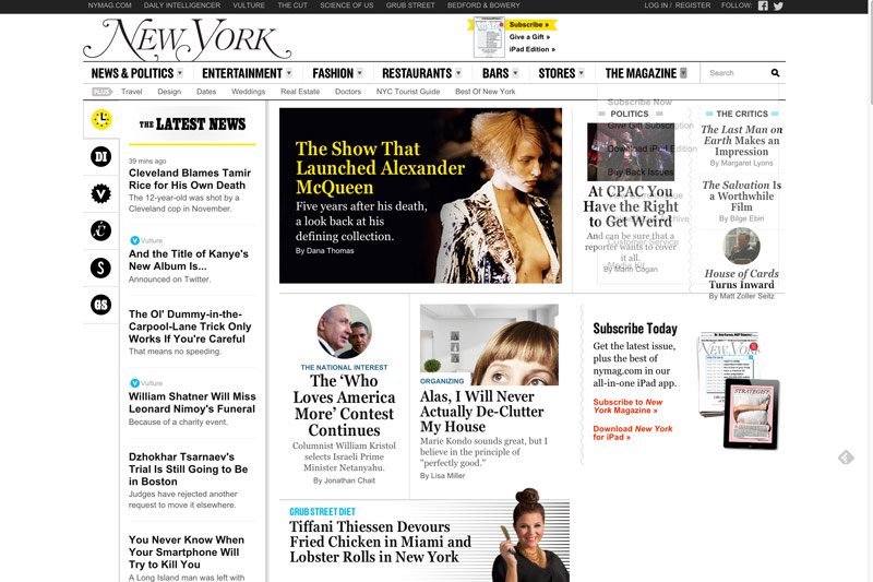
New York Magazine does a great job of exemplifying a hierarchy of content, but still must display a lot of content. Content can be imagery and/or words, in this case they beautifully display typography.
Work with static imagery
Sliders also allow us to drive sales. Content can be beautifully presented with simple static imagery and a bright call to action. Instead of putting a slider in that focuses on different aspects of the sale, it is simplified. Another takeaway from this is fewer choices lead to easier decisions for the user. So focusing on one goal versus many solves this issue. Square exemplifies this.

In the end of my research, I discovered that finding what is the goal the slider is trying to accomplish lead me to finding a few different design solutions and lots of examples used by big content hubs and businesses. The fact of the matter is, as we optimize for speed and usability, sliders become more and more obsolete.

Leave a Reply